
How to Choose Your Bridal Lehenga Colour Based on Your Wedding Venue and Season
Penned by Parihita Atelier
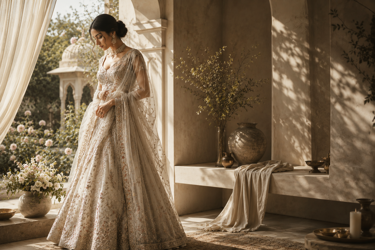
There comes a moment every bride reaches, usually somewhere between the third and fourth Pinterest board, where the question stops being "what colour do I love" and becomes "what colour will actually work." A shade that looks breathtaking on a screen can fall completely flat under a hotel ballroom's yellow lighting, or overwhelm a bride standing against the soft sandstone of a heritage haveli. Colour is not chosen in isolation. It is chosen in conversation with a venue, a season, and the light that will fall on you the day you wear it.
This is one of the most overlooked parts of planning a bridal lehenga, and it deserves far more attention than it usually gets, especially when it comes to choosing your wedding lehenga colour.
Why Venue Changes Everything
Before fabric, before embroidery, before silhouette, the venue quietly decides which colours will actually look their best on you.
| Venue Type | Lighting Character | Colours That Work Well | Colours to Approach Carefully |
|---|---|---|---|
| Heritage haveli or fort | Warm, golden, often dim | Deep maroon, emerald, royal blue, gold | Pale pastels can get lost |
| Beach or destination wedding | Bright, natural daylight | Coral, blush, sea green, ivory | Very dark, heavy tones can feel out of place |
| Banquet hall or hotel ballroom | Artificial, often warm-toned LED | Jewel tones, wine, deep purple | Cool pastels can look washed out |
| Outdoor garden or lawn | Natural daylight, greenery backdrop | Peach, mint, soft yellow, blush pink | Colours close to green foliage can blend in |
| Temple or traditional ceremony | Warm, often low, candle or diya lit | Red, maroon, mustard, gold | Very cool or muted tones can appear dull |
Reading the Light Before Reading the Trend Report
A colour that photographs beautifully on Instagram may behave completely differently in person. Here is what actually determines how a shade will look on your wedding day.
- Warm venues favour warm colours. Havelis, temples, and diya-lit mandaps have amber, golden undertones in their lighting. Reds, maroons, mustards, and golds harmonise with this naturally, while cool blues and greys can look muted or grey rather than rich.
- Bright outdoor venues are more forgiving. Natural daylight renders colour accurately, which is why beach and garden weddings give you far more flexibility, including softer pastels that would disappear under artificial light.
- Ballroom lighting is rarely neutral. Most banquet halls use warm-toned LED lighting, which intensifies reds and golds but can dull cooler tones like lavender or icy blue.
- Consider your photographs, not just the room. A colour can look stunning to the eye in a dim venue but appear flat or overly dark in photographs. If photography matters to you, ask your designer about colours that hold their richness even in low light.
Season by Season: What Actually Works
Season affects both comfort and colour psychology, and Indian weddings span every possible climate depending on when and where they happen.
Winter Weddings (November to February)
Winter light tends to be softer and cooler, and heavier fabrics suit the season both practically and visually.
- Deep jewel tones such as emerald, wine, and royal blue feel especially rich against winter's muted daylight.
- Velvet and heavier silk bases work beautifully in this season, both for warmth and for how they catch low winter light.
- Gold and maroon combinations remain a reliable, regal choice for December and January ceremonies.
Summer Weddings (March to June)
Heat and humidity change everything, from fabric choice to how long you can comfortably wear heavier embellishment.
- Lighter tones such as blush, mint, and soft coral reflect heat and photograph beautifully in bright daylight.
- Breathable fabric bases matter as much as colour here. A heavily embellished lehenga in a heavy fabric can become uncomfortable over a long summer ceremony.
- Pastels paired with subtle gold or silver work can offer the richness of a bridal look without the visual and physical weight of darker shades.
Monsoon Weddings (July to September)
Monsoon weddings are increasingly popular for their dramatic skies and lush, green backdrops.
- Rich jewel tones like teal, deep purple, and forest green complement the greenery and moody light beautifully.
- Water-resistant fabric treatments are worth discussing with your designer if your ceremony includes any outdoor elements.
- Avoid very pale colours if your wedding involves any outdoor movement, since monsoon settings tend to be muddier and more unpredictable.
Post Monsoon and Festive Season (October to November)
This is peak wedding season in India, and it borrows the best of both warmth and versatility.
- Classic reds, oranges, and golds align naturally with the festive energy of Diwali season weddings.
- This is also the most flexible season for colour, since temperatures are moderate enough to support both heavier and lighter fabric bases.
A Practical Framework for Choosing Your Colour
If you are still deciding, this is the sequence we recommend at every consultation.
- Confirm your venue and note whether the lighting is primarily natural, warm artificial, or a mix across different functions.
- Identify your wedding season and shortlist two or three colour families that suit both the climate and the light.
- Consider your skin undertone alongside these shortlisted colours, since the same shade of red can look completely different against warm versus cool undertones.
- Test fabric swatches in the actual venue lighting wherever possible, or under lighting conditions as close to it as you can arrange.
- Balance colour against embellishment. A bold colour with heavy zari work can look busy under warm light, while the same colour in a more restrained design often photographs and wears better.
Matching Colour to Your Skin Undertone
Venue and season set the outer boundaries of your colour choice, but skin undertone decides how that colour actually sits on you. This is a step many brides skip entirely, and it is often the reason a colour that looked perfect on a mood board feels slightly off once the lehenga is finished.
- Warm undertones (skin with golden, peachy, or yellow hues, veins that appear more green than blue on the wrist) tend to glow in mustard, rust, warm reds, gold, and olive green.
- Cool undertones (skin with pink or bluish hues, veins that appear more blue than green) are usually flattered by jewel tones such as royal blue, emerald, magenta, and true reds with a blue base rather than an orange one.
- Neutral undertones have the most flexibility and can generally wear both warm and cool colour families with equal ease, which is worth knowing if you are torn between two very different palettes.
A simple way to test this before committing is to hold a few fabric swatches near your face in natural daylight. The colour that makes your skin look brighter and more even, rather than dull or sallow, is usually the one worth building your bridal look around.
Common Mistakes Brides Make With Colour
A few patterns come up again and again during consultations, and knowing them in advance can save both time and disappointment.
- Choosing a colour purely from social media without accounting for venue lighting. A shade that trended in a bright, sunlit reel can look entirely different in a dim indoor mandap.
- Ignoring the difference between screen colour and fabric colour. Screens display colour through light, while fabric reflects it, and the two rarely match exactly. Always request a physical swatch before finalising.
- Overlooking how colour interacts across multiple functions. A colour that works beautifully for an evening reception may not translate as well to a bright daytime Haldi, which is why many brides now choose a distinct but complementary palette for each function rather than repeating one shade throughout.
- Underestimating how embellishment changes colour perception. Heavy gold zari work on a dark base can shift how saturated a colour appears compared to the same shade with lighter, more restrained embroidery.
Regional Colour Traditions Worth Knowing
India's wedding colour traditions vary widely by region, and many brides choose to honour these customs even within a fully bespoke, contemporary design.
- In North Indian weddings, red and maroon remain the most traditional bridal colours, often paired with gold zari work, though contemporary brides increasingly choose deep jewel tones like emerald or wine as a modern alternative.
- In South Indian weddings, traditional Kanjivaram silks are often chosen in combinations like deep red with a gold or green border, or a mustard yellow that holds cultural significance in several communities.
- In Bengali weddings, red and white remain deeply traditional, particularly the red bordered white saree associated with Bengali bridal customs.
- In Gujarati and Rajasthani weddings, vibrant colours such as bright red, orange, and pink are common, often layered with mirror work and vivid embroidery that suits both the region's aesthetic and its predominantly warm, sunlit venues.
Understanding these traditions gives you a starting point, even if your final choice moves in a more personal or contemporary direction.
Colour does not exist independently of fabric. A Banarasi silk in deep maroon behaves very differently under light than a Tussar silk in the same shade, because of how each fabric's natural sheen interacts with its surroundings. Heavier silks with more sheen amplify warm venue lighting, while matte fabrics like Tussar soften it. This is why choosing your wedding lehenga colour and fabric together, rather than one after the other, tends to produce a far more considered result.
Bringing It Together
The bride who walks into her venue in a colour that was chosen for that specific room, that specific season, and that specific light, tends to look effortlessly right in every photograph, without anyone quite being able to explain why. It is rarely an accident. It is usually the result of a conversation that happened months earlier, between the bride, her designer, and the details of the day itself. This is also why colour should never be the very last decision made before a lehenga goes into production. When it is treated as an early, deliberate choice rather than a final formality, everything else, from fabric to embroidery density to embellishment placement, tends to fall into place with far less back and forth.
At Parihita, a bespoke bridal wear studio, colour consultation is built into every bespoke commission, not treated as an afterthought. Before a single sketch is finalised, we discuss your venue, your season, and even the time of day your ceremony takes place, so the lehenga you commission is designed to look its absolute best in the exact setting it was made for.
If you already have a venue and date locked in, our iDesign Studio is the right place to begin this conversation, wherever you are based. Or explore pieces across our current collection to see how colour, fabric, and venue come together in past commissions. For anything more specific, our concierge is always happy to talk it through.
Spread the Heritage
Enchanted by this story?
Invite your inner circle to discover the world of bespoke luxury at Parihita.
Share on WhatsApp